Threads

How to correctly visualize the good/fast/cheap triangle

5 tweets · October 2022 · 47 likes · 0 retweets · read on Twitter

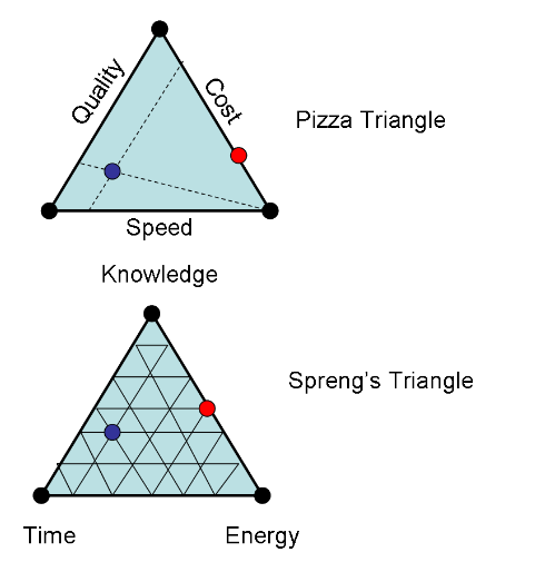
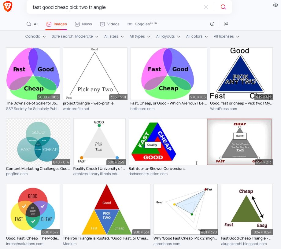
wow, people are so bad at visualizing stuff the correct way to visualize the "good, fast, cheap; pick 3" in a triangle is to put the 3 items on the *edges*, and then each corner represents the extreme absence of the opposite edge, and you can represent every other possibility
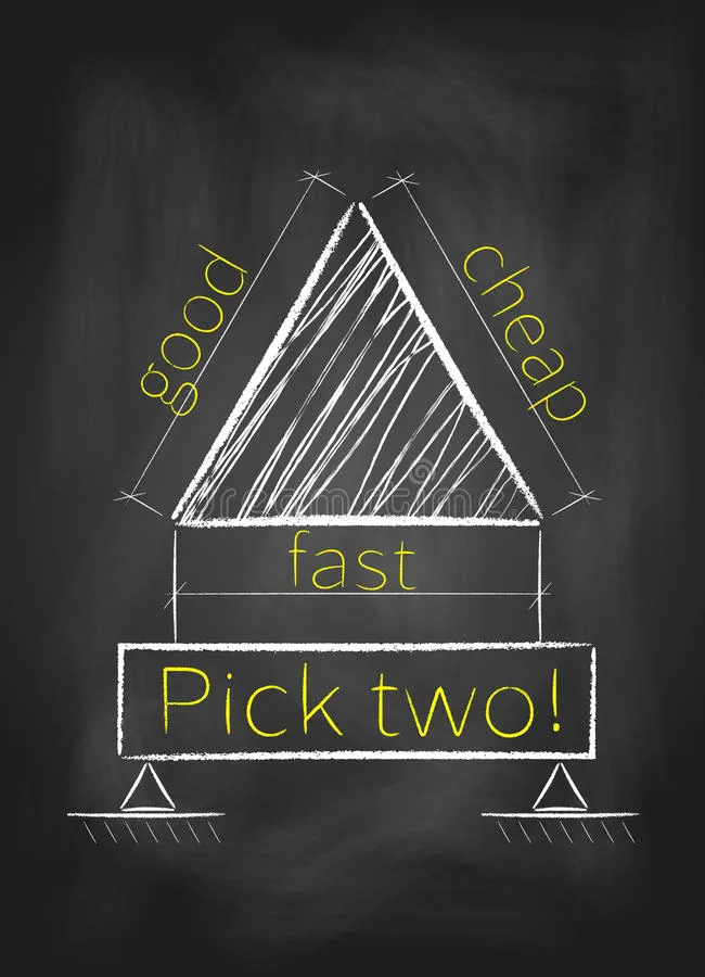
this blackboard illustration is correct, although the "pick two!" seeming to be held up by little thingies is weird & distracting and the lines next to "good" etc feel like the suggest the opposite of what you want to suggest here

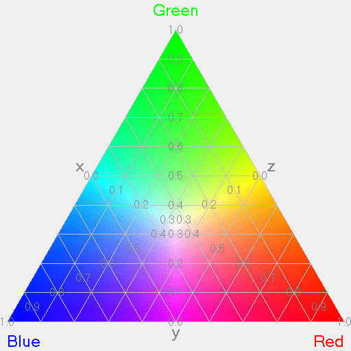
probably the way I'd do it is with colors... but you have to make the gradient heavier at the edges (most color triangles put the primary colors at the corners)

welp, nerdsniped, here it is:

Malcolm Ocean 🏴‍☠️ @Malcolm_Ocean ·

there were no adequate visualizations of the good+fast+cheap triangle, so I made one:

Venkat knows the deal ofc, and has this great post outlining both "pick two" and "pick one" triangles. ribbonfarm.com/2007/11/22/vis…