OSes & ways-of-being 😍👇 Part of what is messy about contemporary technology is the everythingness of everything. Hard to stay focused in reading a book while reading it on a device that's also everything else.
Nurturing design: modal interfaces that guide intention
19 tweets · December 2019 · 65 likes · 3 retweets · read on Twitter
Modalness (when an app enters a state that prevents you from doing things you can do in other states) is oft considered bad design, but why? Something about blocking the user's intent. #UXdesign
There are perhaps 3 kinds of design: 📄😶 neutral design = get out of the way. Docs, MP3 player 🎰🤑 exploitative design = hack the user. Facebook, slot machine 🤍🤔 nurturing design = guide the user in integrating complex & conflicting desires. complice.co as an ex
There are way more examples of neutral & exploitative design than nurturing design, unfortunately. This is the topic of @andy_matuschak's original thread:
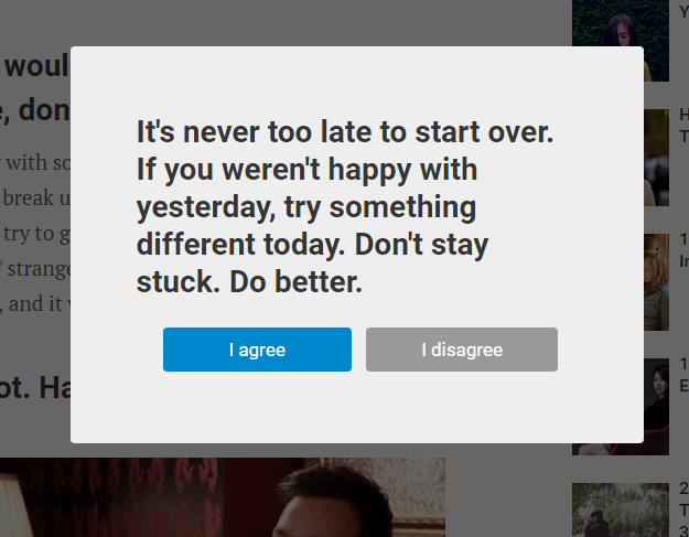
It seems clear that in neutral design, modals are just in the way, because neutral design is trying to just let the user do what they want to do. Likewise, in exploitative design, modals represent a way of manipulating the user. Here's a super-obvious example:
By contrast, I'll talk about my app, Complice, which uses modal states intentionally. It's a goal-oriented productivity app. "Goal" doesn't necessarily mean quantifiable or deadline-bound though. We see it more fluidly, as what's most important:
The first way Complice uses modal states is by separating the daily workflow of the today page into three phases:
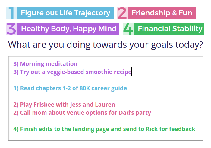
By separating intention-setting & reflection out from do-tasks mode, Complice blocks certain user intents, & in the process creates clearer contexts for when to do these different things. More is possible here—it's still easy to fall into old patterns.
2nd modal type guides momentary flow of user's choice-making to be more conscious & intentional. If you don't do something one day, instead of it staying on the list tomorrow, you have to consciously intend it again. And after a couple of days skipped, Complice starts prompting:
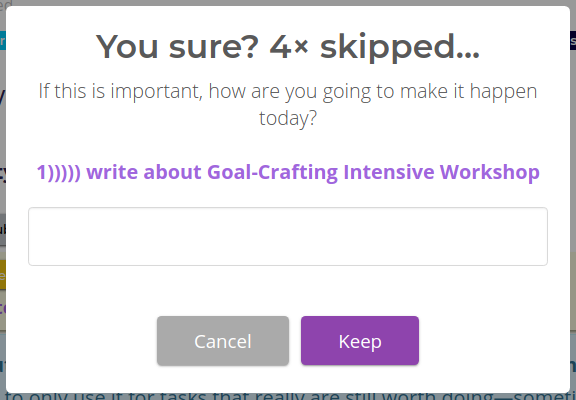
This adds friction—in a place where friction helps the user stay in touch with what they deeply care about 💖 Often there's a reason we don't do something today, and if we don't stop to listen, we might not notice something our intuition knows.
So! There are some examples of modal interfaces used to nudge users towards valuable and easily-overlookable parts of workflows, and help them curate their focus. I'm about to go abstract again, so open this link in a new tab & check out Complice later 🚀 complice.co/?ref=twittermo…
Okay, abstract again: what does nurturing design look like on the level of an operating system? There are some neat hacks that a few friends of mine have tried, to give their computer different modes, oriented to work or play or other options. Easier on desktop than on phone.
What if you could boot up your phone into a mode where you couldn't access any of your messenger apps? What if you could boot it up into a mode that only had your ebook reader & notes app? What about a mode where messages can be sent but not received? (Hard to do on OS lvl)
How long would it have taken for them to invent airplane mode if it hadn't been required by airplanes??? Half-decent do-not-disturb & silence & notification control just hit android a couple years ago. & that's tiny stuff.
Ways of being. What matters. In Complice, almost everything one does is connected to a goal/purpose. Many people then want to have those goal names/colors elsewhere to organize things. WorkFlowy, IFTTT+Hue, Gmail labels (out of date), post-its (can't find photo)
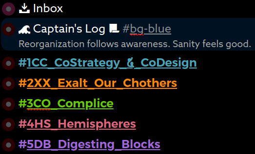
What would it look like for "thing I care about" to be a sort of natural object that syncs between apps, in the way that contacts, calendars, docs do? It's tough. No matter how meaningful, any articulation of purpose is at best oversimplified and at worst a proxy.
But still; currently companies are pouring billions of dollars into optimizing their apps to hack peoples' brains to make metrics go up. Design by proxy, not by vision, purpose, or a sense of alignment with the *user's* vision, purpose, or empowerment.
I hack twitter with userstyles & userscripts so it won't fuck with me as much, but there's only so much I can do given the platform constraints. Tho seriously check this 👇 out if you hate the red dot. Omg I'd go crazy using this site without this:

I notice finding it hard to stay as big-picture visionary as @andy_matuschak & @tristanharris were inviting. Given that I can usually come up with a lot of ideas for improving systems, that's a sign that our whole design paradigm is busted in some way I haven't seen thru yet 🤯